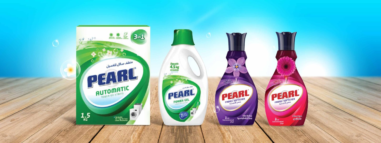
Pearl Qatar Detergent - Branding for a Fresh Impact
Pearls Shine Brighter: A Modern Refresh
Qatari favorite Pearl Detergent, known for its fabric care legacy, seeks to stay modern. We’ll refresh their brand identity and packaging design for a more dynamic and effective presence across new categories, while maintaining recognition for their loyal customer base.
Challenge
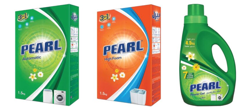
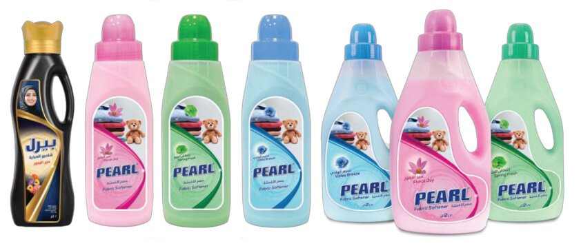
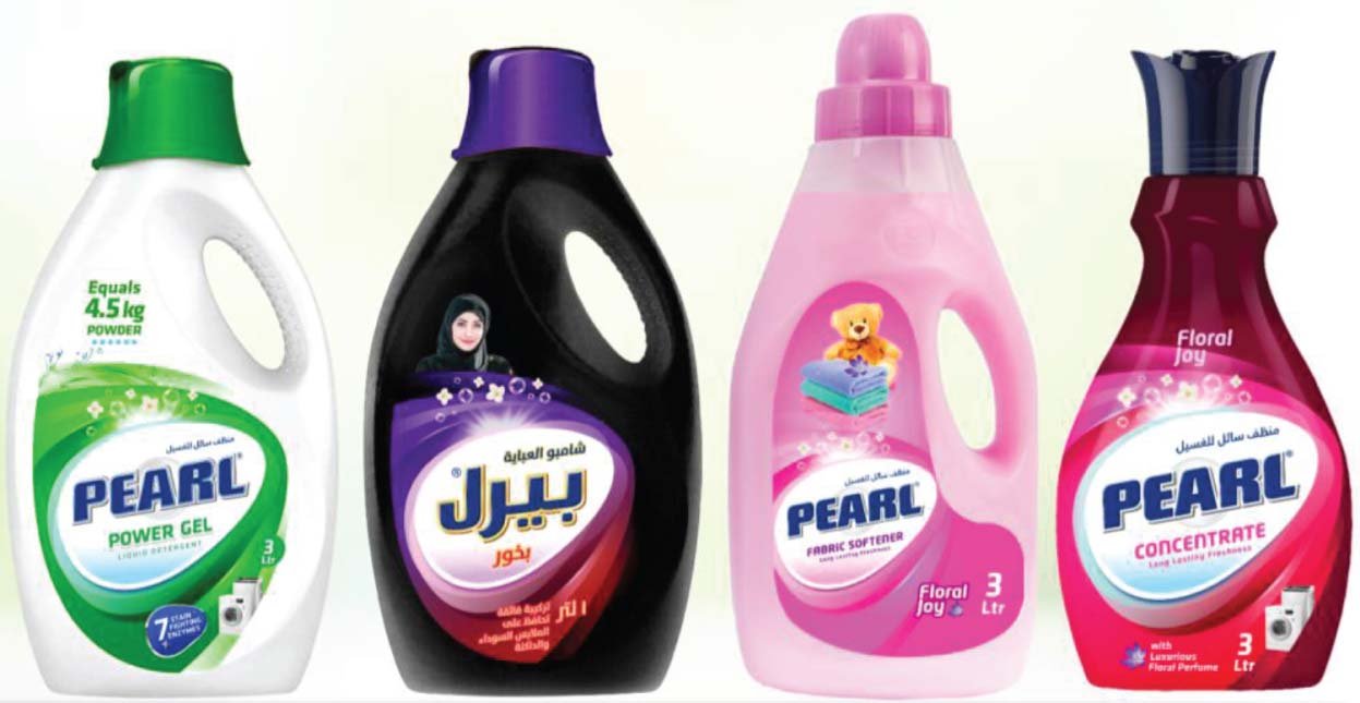
Staying attuned to consumer preferences, how could Pearl Detergent stay ahead of the game? We decided to redefine the architecture by making it highly effective, thorough, modern, and dynamic. The new design sheds light on a consistent theme across the liquid range while retaining some elements from the current range.
Creative Solutions
Putting our plan into action, we conducted an audit that evaluated the key players in the category. Next, we focused on devising a design template that interweaves the overall portfolio of the Pearl liquid category. That’s not all, we designed unified imagery and architecture to strengthen the products’ shelf presence and align the visuals, thoughts, and intentions in a way that propels the brand to grow in the market.
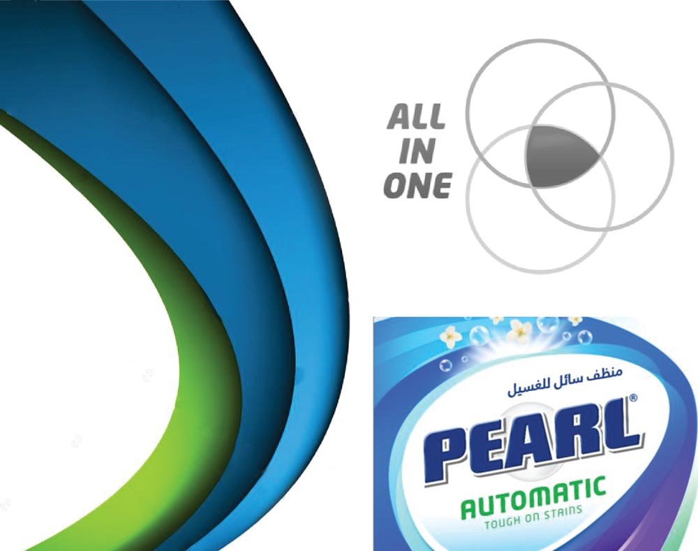
Basis for Architecture
- One brand for all fabric washing needs.
- One stop solution.
- Highly Effective & Thorough.
- Modern & dynamic in approach.

Results
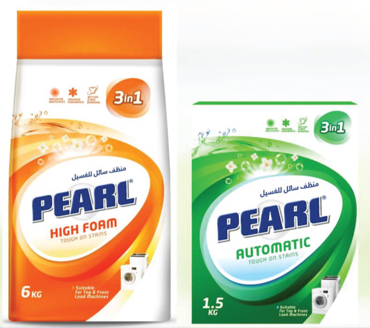
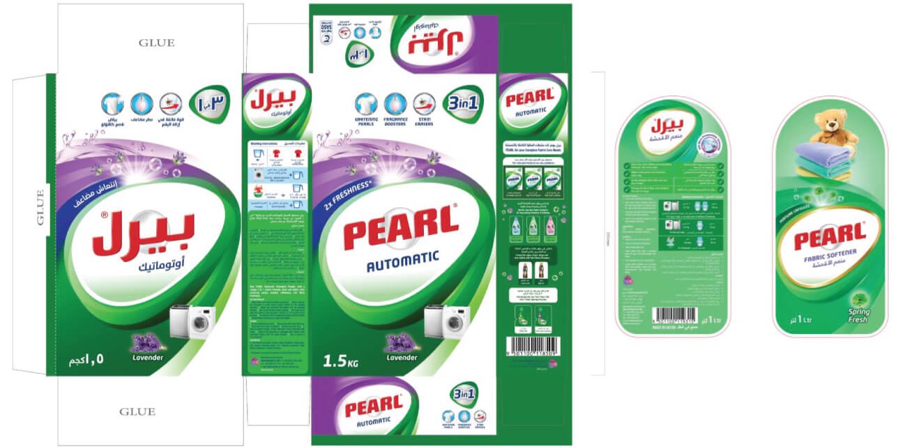
Adding a youthful, distinctive, and contemporary touch to the packaging design, we made it more category-appropriate, effectively communicating the brand proposition. We ensured that only the side and back packaging included creative content and design elements. Moreover, our thorough design allows consumers to recognize, recall, and trust our products and future products that will fall under one cohesive umbrella.
Branding & Packaging Design