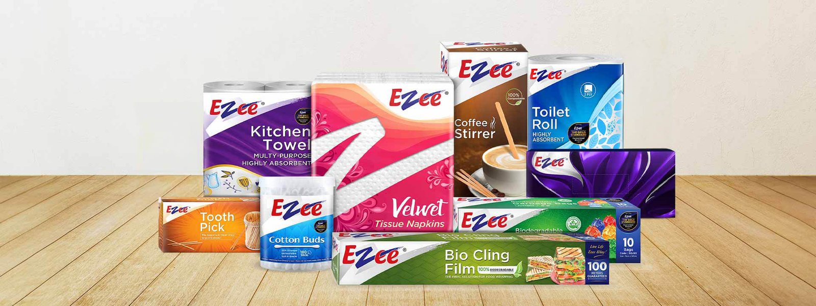
B2B to B2C Buzz: Ezee's Design Makeover Wins Consumers
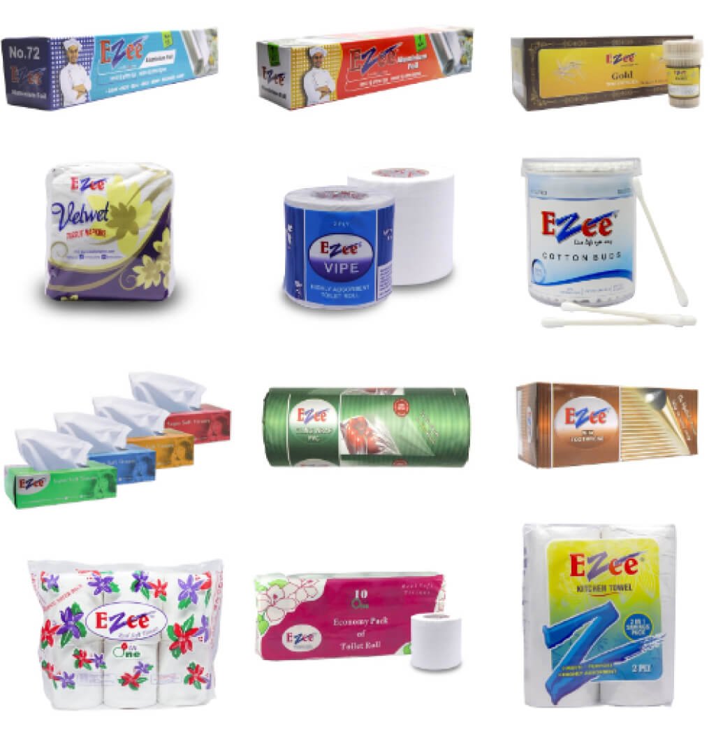
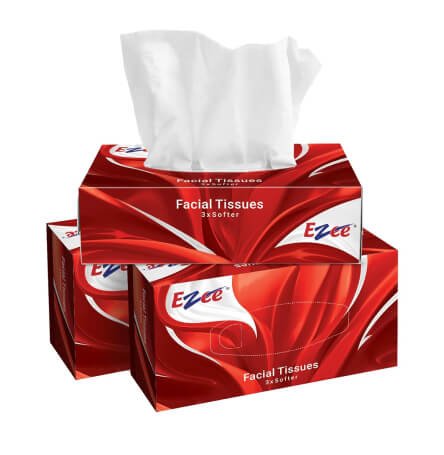
B2B leader Ezee, the top disposable manufacturer, boasts quality and a broad product range – Foil Paper, Cling Wrap, Toilet Tissue, Paper Towel, and more. However, their B2C presence is faint. Ezee needs a design refresh to resonate with consumers, unify presentation, and craft a compelling B2C message. Their product offerings also lack a clear focus in a crowded market.
Challenge
Despite leading in the B2B segment, Ezee’s presence in the B2C market remained faint. Navigating through a sea of clutter, the brand design lacked the magnetic appeal to draw consumers in and the scattered product offerings left no room for differentiation.
Creative Solutions
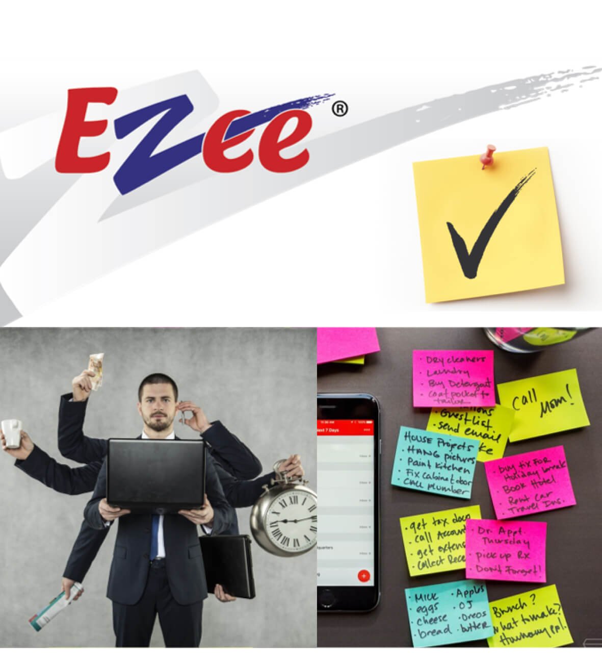
Embarking on this journey of brand evolution, we seamlessly integrated Ezee into consumers’ lives by focusing on brand building, marketing, and promotion. We aimed to establish a deep brand connection while tapping into market trends, redesigning for growth without affecting current equity. Why settle for the ordinary when consumers could live the Ezee way? We made ‘Ezee’ relatable by showcasing how it simplifies life’s complexities and created a signature style with the ‘Tick Mark’ to reinforce the brand’s strong identity across its wide range of products.
Results
The “Live life, Ezee way” campaign successfully positioned Ezee as the solution to everyday hassles. By emphasizing a relatable brand name and a consistent “Tick Mark” visual identity, Ezee strengthened its connection with consumers and effectively communicated its core value of simplification.
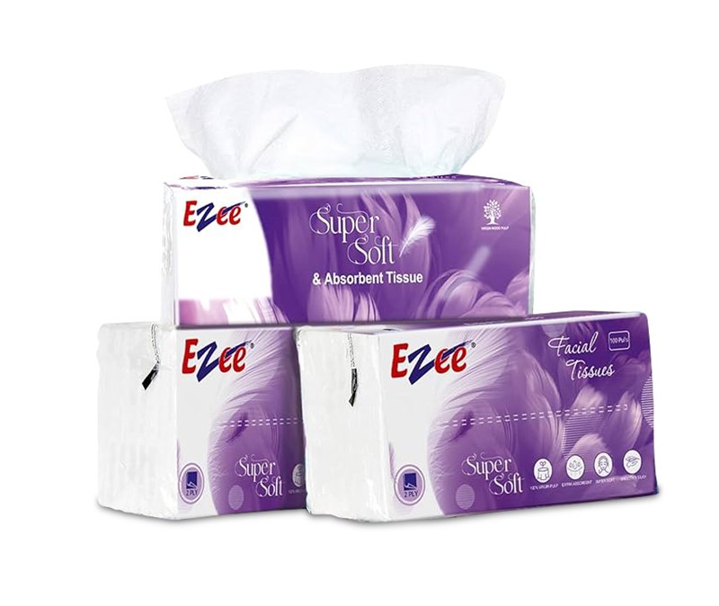

OLD LOGO