Designing Dalmia Gold Identity and Packaging
Dalmia Gold, a renowned brand in the tea industry, aimed to revamp the packaging for its premium chai variants – Masala Chai, Elaichi Chai, and Adrak Chai. The objective was to create a design that not only stood out on the shelves but also communicated the rich, authentic flavors and high quality of the tea. The new packaging needed to reinforce the brand identity, create visual appeal, resonate with tea lovers, and clearly differentiate between the three chai variants while maintaining a cohesive look.
Creative Solution
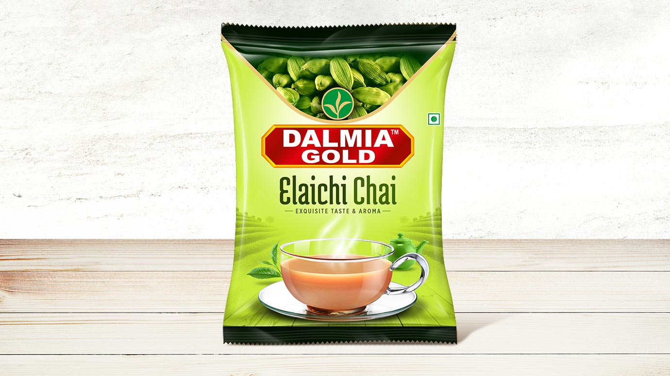
The design process began with extensive research and inspiration gathering, focusing on traditional Indian elements and the natural ingredients used in the chai. Various design concepts were explored, integrating traditional and modern aesthetics. Vibrant colors were selected for each variant: warm orange for Masala Chai, fresh green for Elaichi Chai, and vibrant yellow for Adrak Chai. High-quality images of key ingredients like cinnamon, cardamom, and ginger were incorporated to highlight the flavors. Clean and legible fonts were chosen for the product name and description to ensure clarity and readability, and the Dalmia Gold logo was positioned prominently to ensure brand visibility.
Results
Following several iterations and focus group sessions, the final design successfully captured consumer attention with its vibrant colors and appealing imagery, leading to increased shelf visibility. The consistent use of the Dalmia Gold logo and cohesive design elements strengthened brand recognition and loyalty. The new packaging design contributed to a noticeable uptick in sales, particularly for the highlighted variants, and received positive feedback from customers who appreciated the clarity of information and the visual representation of flavors.